
Ray Larabie
Ray Larabie | |
|---|---|
| Born | 1970 (age 53–54) |
| Occupation(s) | Typographer, Type designer |
| Years active | 1996–present |
| Known for | Designing novelty computer fonts |
Raymond Larabie (born 1970) is a Canadian designer of TrueType and OpenType computer fonts. He owns Typodermic Fonts type foundry, which distributes both commercially licensed and shareware/freeware fonts.
Biography and career
[edit] | |
| Sample |
Larabie was born in Ottawa, Ontario, Canada. In his self-published autobiography, he states that he graduated from Sheridan College with a degree in classical animation, a field that was largely obsolete by the time he received his degree.[1] Larabie was employed at Rockstar Canada and had contributed his designs to multiple video game titles, including the hit series' Grand Theft Auto and Max Payne, before he quit the company in 2002 to focus full-time on type design, after having released a series of freeware fonts over the Internet under the brand LarabieFonts since 1996.[2] Larabie recalled an incident in which Rockstar had used his Pricedown font for the Grand Theft Auto logo, completely unaware that its designer was their own employee.[1] He moved to Nagoya, Japan in 2008, maintaining his Canadian citizenship.[1]
Larabie primarily specializes in novelty typefaces that are intended for use in desktop publishing and graphic design. The logo for Grand Theft Auto, for instance, uses Larabie's Pricedown font, which is based on the logo for the international game show The Price Is Right, as well as for the Disney animated series Fillmore!. In addition to game shows, Larabie has also used 1960s and 1970s graphic logos, computer emulation, and other inspirations to design his fonts; most of his designs are display faces not meant for body text, with Larabie acknowledging that he had difficulties with italic type and, especially in his early career, had difficulties adapting katakana and hiragana to his designs.[1] He is particularly known for his “ubiquitous futuristic and sci-fi fonts”; Larabie specialized in that style early in his career because he felt that, other than a few examples such as Bank Gothic, Microgramma and Eurostile, the market for that style was underserved.[3]
Two of his typeface families, Marion and Superclarendon, are released with macOS.[4][5] Larabie's "Canada 150" is an extended version of his previous font Mesmerize (in turn based on 1920s calligraphic German sans-serifs such as Semplicità and Kabel) with Cyrillic and First Nations alphabets included; it was commissioned by the Government of Canada to be the official typeface for the country's sesquicentennial. The government paid him nothing for the custom work,[6] which he subsequently placed into the public domain. He would proceed to release large portions of his Larabie Fonts library (inasmuch as he could, since some of the designs were derived from freeware that turned out to be copyrighted and thus could not be re-released), along with less successful designs for Typodermic, into the public domain in 2020, 2022 and 2024.[7][1]
Larabie has drawn controversy for releasing fonts freely; other professional designers took particular umbrage at Canada 150, stating that the government should have paid for a professionally drawn type since, it was posited, a government has the money to do so. Larabie responded to the criticism by saying "You can’t just throw a couple hundred grand at a problem and that’s the solution for every problem."[8] In another case, attorneys for Metallica sent Larabie a cease and desist order over one of his freeware fonts, Pastor of Muppets, for having taken letter designs from Metallica's wordmark; though Larabie maintained that, as Americans, they could not claim copyright over character designs as they did not meet a threshold of originality, he complied with the order (also noting that the use of the Muppets name could have drawn further trademark challenges), but found that the font had been too widely distributed to withdraw it from all the sites that had begun distributing it. Metallica never pressed any further action and Larabie, in his autobiography, stated that he wanted nothing further to do with the font and would never release it again.[1]
Typefaces
[edit]- Coolvetica—an eccentric neo-grotesque sans-serif based on Chalet and 1970s Helvetica, Larabie's most popular font
- Foo—used for Super Mario RPG: Legend of the Seven Stars (PD)[7]
- Neuropol—a modified version of which was used in the wordmark for the 2006 Winter Olympics[9] (PD)[7]
- Pricedown—used for the logo of Grand Theft Auto. Based upon Pinto Flare.[10]
- Stereofidelic (PD)[7]
- Mesmerize (PD)[7]
- Kawashiro Gothic, Japanese gothic typeface based on the Mesmerize typeface
- Canada 1500, based on the Mesmerize typeface; supports Greek, Cyrillic, Vietnamese, and Canadian Aboriginal syllabics[11] (PD)[7]
- Blue Highway, based upon the American highway sign typeface (PD)[7] and its commercial counterpart Expressway
- Ethnocentric
Samples
[edit]-
 Pricedown, as seen in the Grand Theft Auto wordmark
 -
 Coolvetica (top, compared to its inspiration Helvetica below) is, according to Larabie, his most downloaded font by far.
 -
 Korataki, Larabie's most purchased commercial font, is used in the wordmark for video game Mass Effect.
 -

-
 Neuropol (modified) in use in the Torino 2006 wordmark
 -
 Canada1500 (Mesmerize) in use for its original purpose on the Canada 150 wordmark
 -
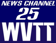 Anklepants, a font based on Westinghouse Broadcasting wordmarks, in use in a former logo for WVTT in Olean, New York


See also
[edit]References
[edit]- ^ a b c d e f Larabie, Raymond (August 10, 2020). Between the Lines: The Hidden Stories of Typodermic Fonts. Retrieved August 21, 2024.
- ^ Cabarga, Leslie. Logo, Font, & Lettering Bible: A Comprehensive Guide to the Design, Construction, and Usage of Alphabets and Symbols. Cincinnati, OH: HOW Design, 2004. 237.
- ^ Tselentis, Jason (August 28, 2017). "Typodermic's Raymond Larabie Talks Type, Technology & Science Fiction". How. Archived from the original on April 18, 2018. Retrieved October 29, 2017.
- ^ "Fonts included with Mavericks". Apple. Retrieved 8 July 2015.
- ^ Larabie, Ray. "Marion". MyFonts. Monotype. Retrieved 8 July 2015.
- ^ "Canada's new national font was designed to include aboriginal languages".
- ^ a b c d e f g 142 Early Typodermic Fonts Released Into the Public Domain. Retrieved December 25, 2020.
- ^ Daubs, Katie (12 January 2016). "Designers fume over free font for Canada's 150th birthday | The Star". The Toronto Star.
- ^ Benincasa, Antonino (March 4, 2014). "Corporate Identity XX Olympic Winter Games Torino 2006". behance.net. Retrieved December 28, 2020.
- ^ "Pinto Flare in use". Fonts in Use. Retrieved 2024-06-29.
- ^ "Canada 1500". Typodermic Fonts. Retrieved 18 September 2020.
External links
[edit]- Ray Larabie at MobyGames
- Typodermic Fonts
- Typodermic on MyFonts
- Typodermic on Fontspring
- Ray Larabie at IMDb
| International | |
|---|---|
| National | |
| Software and libraries | |
|---|---|
| Licenses | |
| Operating system, corporate and professional |
|
| Government typefaces | |
| Other typefaces | |
| Groups and people | |